
Finfare
© 2022
01.
Intro of case
Finfare is a U.S.-based fintech, headquartered in California, founded in 2021, specializing in corporate banking services and business expense management with extensive use of artificial intelligence and machine learning. Its mission is to transform how companies manage their finances, offering solutions that optimize revenue, reduce risks, and automate financial processes with high efficiency.
Project Objective:
To modernize and reposition Finfare’s institutional website, transforming it into a clear, responsive, and value-aligned communication tool. The previous site was outdated, lacked functionality, and failed to reflect the company’s innovative, tech-driven identity.
My role:
As a Senior Product Designer, I focused on restructuring navigation journeys and the visual interface (UI). I was responsible for rethinking the layout, visual hierarchy, and usability of the site, ensuring clarity, performance, and an updated brand identity.
02.
Work challenges
Before the redesign, Finfare’s website faced several critical issues:
Outdated visuals misaligned with the brand’s tech positioning.
Lack of clarity about the core business and services offered.
Responsiveness issues: the site broke on mobile devices and had illegible fonts.
Insufficient visual contrast, hindering readability.
Overly technical and generic text, lacking focus on practical benefits.
The site failed to convert: it didn’t generate leads, explain the value proposition clearly, or support business growth.
03.
Research and Discovery
Approach:
To understand pain points and opportunities, I conducted interviews with real users and company stakeholders, focusing on:
How users perceived Finfare.
Which information was ignored or misunderstood.
Which devices and channels clients used to access the site.
Barriers to understanding, trust, and conversion.
Key Investigative Questions:
What does Finfare do?
What product or service does it offer?
What makes it different from other solutions?
Do you access it more on mobile or desktop?
What did you understand when visiting the site for the first time?
What would motivate you to become a customer?
Key insights:
Lack of clarity:
Users were unsure if Finfare was a bank, a lender, or a credit platform.
Comprehension difficulty:
The text used financial jargon and lacked accessible language.
Mobile performance issues:
Slow loading times and severe layout failures on small screens.
Low visual contrast:
Light colors on small text made reading difficult.
Misaligned messaging:
Too technical, with little focus on direct customer benefits.
04.
Diagnosis and Objectives
Core Problem:
Finfare’s website did not reflect its value proposition, hindered conversions, failed to generate leads, and created a misaligned perception of the business in the market.
Strategic Objectives
Create a modern, responsive, high-performance digital visual identity.
Adjust copywriting and design to clearly explain Finfare’s services and differentiators.
Fix usability and responsiveness issues across multiple devices.
Reduce loading times and increase time spent on the site.
Position Finfare as a leader in AI-driven financial solutions.
05.
Ideation and Proposed Solutions
Implemented Solutions:
Complete redesign of the site’s architecture, focusing on scannability, storytelling, and value triggers.
Creation of modern, responsive components using adaptive grids and accessible typography.
Application of better contrast colors to ensure readability and accessibility.
New benefit- and pain-point-oriented copywriting, using simple, direct language.
Highlighted Finfare’s core products with intuitive, objective visual blocks.
Methodology and Tools:
Used Design Thinking and Double Diamond methodologies.
Created high-fidelity navigable prototypes in Figma.
Conducted continuous validation with the CEO, tech lead, and product stakeholders.
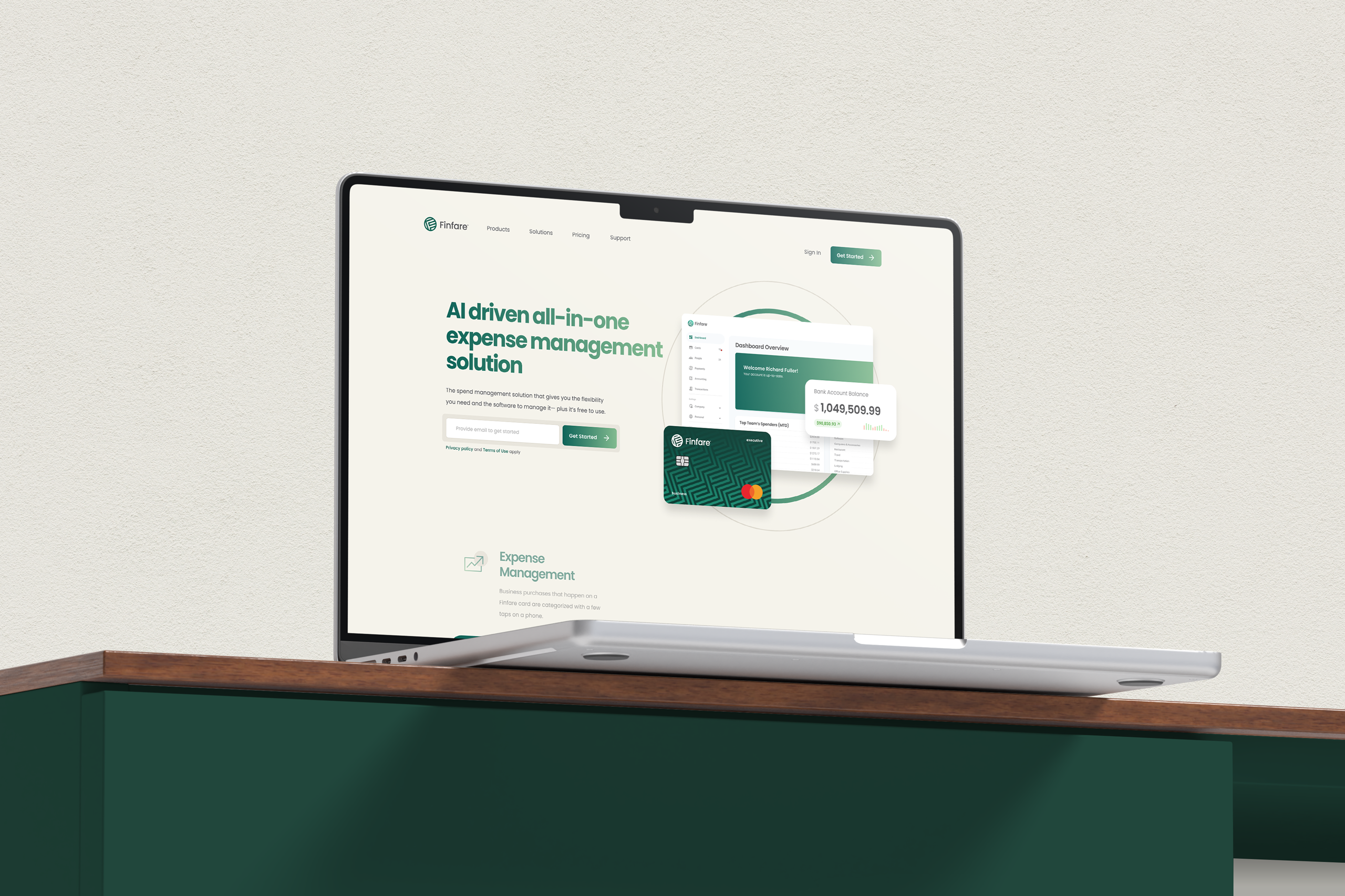
06.
Final Solution
The new Finfare website delivers a clear, objective, and professional experience, featuring:
Modern, minimalist, and responsive design.
Strong, clear messaging on the homepage’s first fold.
Well-structured components focused on visual performance and comprehension.
Mobile-first layout with optimized loading and fluid navigation.
07.
Results and Impact
Observed Impacts:
Increased average time on page, indicating greater engagement.
Significant improvement in loading speed and mobile performance.
Highly positive feedback from investors and strategic partners.
More qualified leads generated through clear forms and CTAs.
Strengthened institutional brand positioning in the financial sector.
08.
Lessons and Reflections
Major Challenges:
- Translating a complex financial solution into a simple, impactful narrative.
- Balancing a modern visual identity with a clear, lightweight technical message.
What I Would Do Differently:
- Start with more mobile navigation tests in early drafts to reduce late-stage adjustments.
Professional Growth:
This project deepened my understanding of how design and positioning work together for companies offering innovative financial products. It solidified my ability to lead digital solutions focused on business outcomes, conversion, and trust—three essential pillars in the fintech universe.