
Fourbank
© 2022
01.
Intro of case
Fourbank is a white label platform for fintechs and financial institutions, providing technology, infrastructure, and regulatory compliance with the Central Bank. The solution enables clients to operate with features such as loans, Pix, TED, billing, transfers, and payments, all integrated into a customized mobile and web application tailored to each company’s visual identity.
The company was in a scaling phase, with a consolidated product but undergoing constant updates. The main goal was to enhance value delivery through personalized, high-quality, low-friction experiences, adhering to UX best practices and focusing on conversion.
My role:
As a Senior Product Designer, I was responsible for identifying friction points in the user experience, conducting research, prototyping solutions, and redesigning journeys for the mobile app and web platform. My focus was on creating scalable and customizable solutions to support the platform’s white label model.
02.
Work challenges
Despite its robustness, the solution faced a significant structural issue: the lack of a scalable and customizable design system led to rework, delays, and high operational costs.
Each new customization required 90 hours of design and 90 hours of development.
Applying each client’s visual identity was labor-intensive, inconsistent, and lacked standardization.
Clients had difficulty understanding what could or could not be customized, complicating layout approvals.
The existing design system was inflexible, hard to replicate, and operationally inefficient.
03.
Research and Discovery
I conducted interviews with strategic stakeholders (CEOs, marketing directors, and C-level executives) and key users to understand what was most valued during the platform’s customization process.
Key Questions Explored:
What is essential to your company’s identity?
Which visual elements are indispensable for app customization?
Do you want to include banners or promotional areas?
Which components should reflect your color palette?
Would you like to customize icons and fonts?
Key insights:
Customization of the logo and button colors was highly valued.
There was strong demand for dynamic promotional spaces within the app (e.g., banners).
Speed in delivering a customized visual prototype was critical for approval.
Prioritization:
I ranked insights based on:
Perceived value to the client.
Impact on delivery time and development effort.
Cost-benefit of implementation.
The work was conducted in collaboration with the PM, tech lead, and project manager.
04.
Problem Definition and Objectives
The internal customization process was poorly structured, inefficient, and highly manual, hindering the scalable growth of the white label solution.
Defined objectives:
Drastically reduce the delivery time for customized prototypes.
Create a flexible, easy-to-maintain, and adaptable design system.
Standardize the customization process, providing greater clarity to clients.
Increase satisfaction and predictability in delivery.
05.
Ideation and Proposed Solutions
Solutions:
Complete redesign of the design system, focusing on modular, reusable, and highly customizable components.
Creation of an interactive visual identity manual, guiding clients on what can be customized and standardizing the submission of assets (logos, fonts, palettes, banners).
Integration of the creative process into the agile workflow, with sprints, plannings, and reviews alongside the development team.
Processes and Tools:
Application of Design Thinking and Double Diamond methodologies.
Creation of wireframes and flows in Figma.
Brainstorms and validations with stakeholders using medium-fidelity prototypes.
06.
Prototyping and Testing
Prototypes:
We developed high-fidelity prototypes simulating the real behavior of the application for clients and internal testing.
Tests Applied:
Usability tests with real users.
Interviews with clients and internal teams to validate functionalities and the manual.
Continuous iterations based on qualitative feedback.
07.
Final Solution
The final solution included two major deliverables:
New White Label Design System:
Components with design tokens applicable by layer (colors, icons, typography, and banners).
Modularity to accommodate various visual identities without rebuilding the base.
Interactive Visual Identity Manual:
A visual onboarding document for new clients, clearly explaining what can be customized, the limits, and how to submit materials correctly.
Differentiators:
Scalability:
The new system serves different clients with minimal effort.
Clarity:
Standardized visual communication reduced errors and rework.
Efficiency:
Design and development teams now operate with greater agility and fewer uncertainties.
08.
Results and Impact
Success Metrics:
- Design time reduced from 90 hours to 9 hours.
- Development time reduced from 90 hours to 30 hours.
- Elimination of rework and revisions.
- Elimination of rework and revisions.
- Increased client satisfaction with personalized deliveries.
- Positive feedback from internal and external stakeholders.
09.
Reflections and Learnings
Challenges Faced:
- Structuring a design system from scratch in a highly regulated and technical environment.
- Ensuring flexibility without compromising brand consistency.
What I Would Do Differently:
- Start standardization work earlier with the development team to avoid accumulating technical debt.
Learning:
This project deepened my understanding of design challenges in regulated and complex environments like finance, allowing me to grow as a strategic product designer specialized in the fintech and BaaS market.
10.
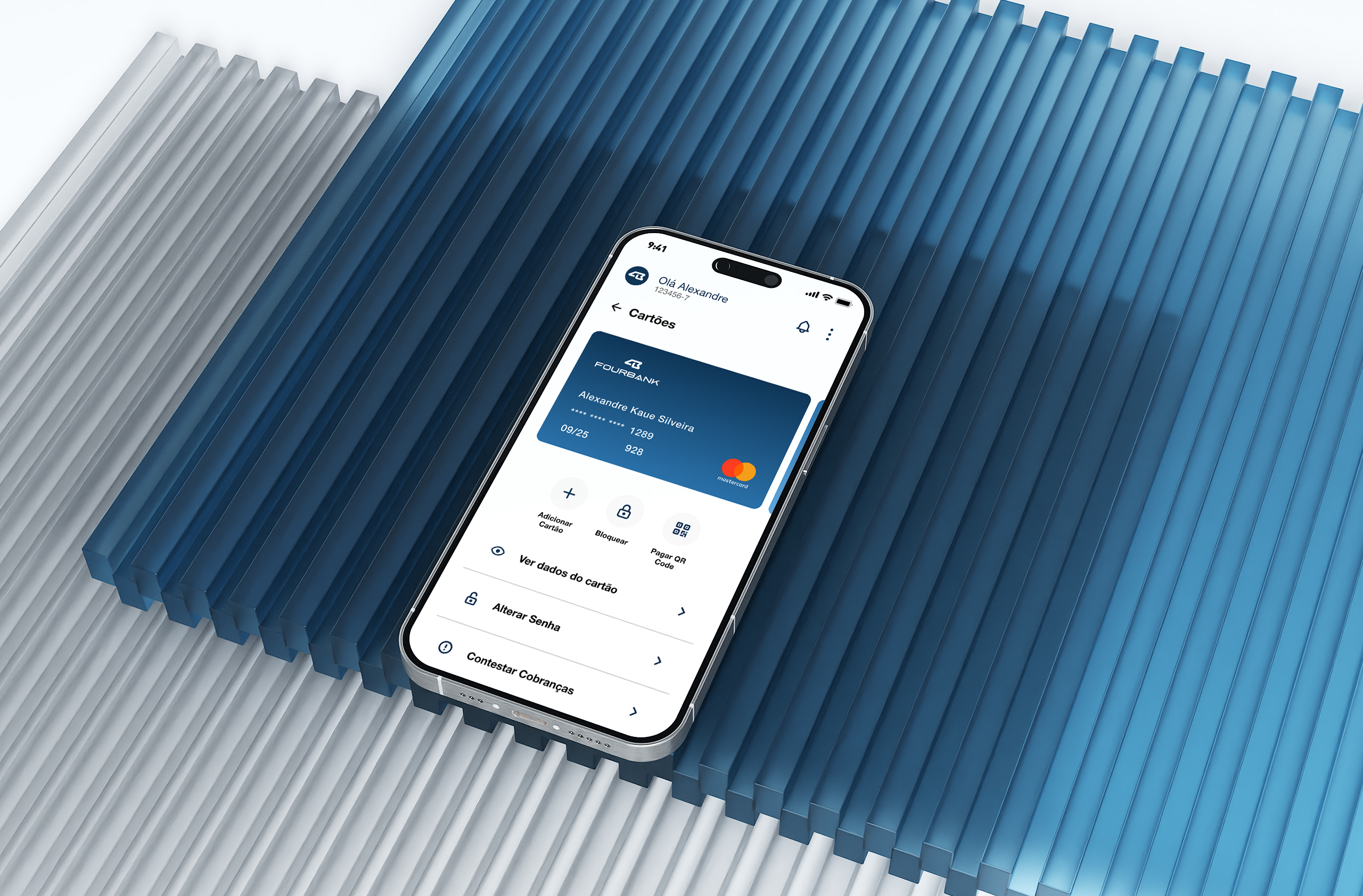
Visual Resources
- Main mobile and web screens
- Design system componentization
- Visual manual for onboarding new clients
- Navigable prototypes in Figma
- White label customization flow diagram