
Pagme
© 2022
01.
Intro of case
Pagme is a Brazilian fintech based in Porto Alegre-RS, specializing in Banking as a Service (BaaS) solutions. Its white label platform enables companies from various sectors to operate as customized digital banks with a complete infrastructure — including Central Bank compliance, security, financial APIs, and a full digital account for individuals and businesses.
The solution targets companies aiming to enter the financial market without the high costs of technology, time, and regulation.
My role:
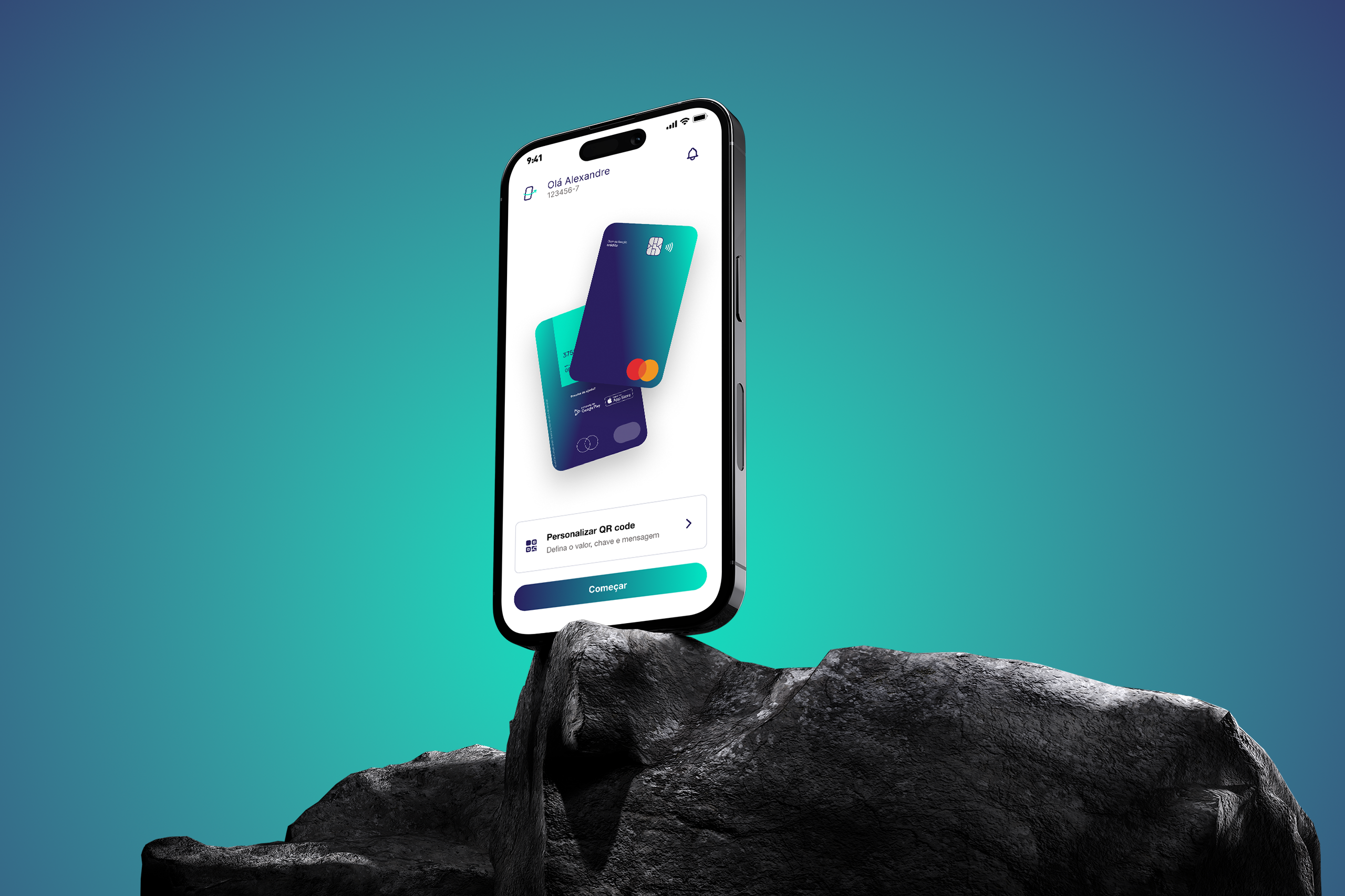
As a Senior Product Designer, I led the restructuring of the onboarding journey for Pagme’s mobile app, used by multiple white label solution clients. My focus was on reducing friction, increasing trust, and improving new user conversion rates.
02.
Work challenges
Despite the robustness of the solution, Pagme faced a critical bottleneck: the onboarding journey, designed with a WhatsApp chatbot-like visual and flow, caused confusion, delays, and a high abandonment rate. Additionally, the process lacked essential technologies like biometrics, secure authentication, and KYC validations — impacting both user experience and regulatory compliance.
Main Challenges:
35% abandonment rate before completing registration.
Robotic, lengthy, and unclear question-based journey.
Lack of biometric authentication or identity validation.
Sense of insecurity when entering sensitive data.
03.
Research and Discovery
Methodology:
6 qualitative interviews with real users to identify pain points.
Analysis of conversion funnel analytics.
Benchmarking with competitors like PagSeguro, Mercado Pago, and previous versions of Pagme’s app.
Key insights:
Where did you experience the most difficulty?
Did you feel secure entering your data?
Was the experience clear or confusing?
Did the visual style and language make sense to you?
Main Insights:
The chatbot format led to slowness, impersonality, and lack of process control.
Many users didn’t understand questions or answered without clarity.
The absence of an introduction or visual tutorial caused confusion early on.
Users felt insecure about entering sensitive data like CPF and addresses.
Prioritization:
We used an Impact vs. Effort matrix to prioritize changes with high perceived value and feasible implementation effort.
04.
Problem Definition and Objectives
Identified Problem:
The onboarding journey was confusing, robotic, and instilled distrust, resulting in low conversion rates and high abandonment.
Strategic Objectives:
Reduce abandonment rate from 35% to under 15%.
Decrease average completion time from 12 to 6 minutes.
Increase account activation rate from 20% to 60%.
05.
Ideation and Proposed Solutions
Implemented Solutions:
Modular Onboarding:
Split the journey into short steps, with the option to skip non-essential information.
Smart Automation:
Used auto-fill for data and progress saving.
Integrated Biometrics:
Added facial authentication and document scanning.
Simple, Clear Language:
Replaced technical jargon with accessible, welcoming communication.
Processes and Tools:
Design Sprint workshop with the product and tech teams.
Prototyping and flows in Figma.
Hypothesis validation with real users via usability tests.
Miro for visual collaboration on initial flows.
06.
Prototyping and Testing
Prototypes:
Low Fidelity: Journey maps in Miro.
Medium Fidelity: Navigable wireframes in Figma.
High Fidelity: Complete prototypes with micro-interactions and screen variations.
Tests Applied:
Usability tests with 5 users guided by real tasks.
Post-test questionnaires measuring clarity, security, and comprehension.
Test Results:
30% increase in completion rate just by splitting into steps.
Average onboarding time reduced by 45% with automations.
07.
Final Solution
Deliverables:
Final prototype with 6 modular, responsive screens and micro-interactions.
Detailed technical documentation for developers, including flows, edge cases, and fallbacks.
Key Features of the New Solution:
Modular and customizable onboarding for different user profiles.
Transparent integration of biometrics and KYC technology.
Design focused on clarity and accessibility.
Reusable components for various white label clients.
08.
Results and Impact
Post-Launch Metrics:
- Abandonment rate reduced from 35% to 12%.
- Average onboarding time: 12 min to 3 min.
- Account activation rate: 20% to 62%.
- Positive user feedback highlighting process clarity.
09.
Reflections and Learnings
Challenges Faced:
- Initial resistance from the dev team to replace the chatbot format.
- Difficulty balancing simplification with mandatory data validations.
- Time constraints for testing with more diverse audiences.
What I’d Do Differently:
- Include more users with low digital literacy in initial tests.
- Plan A/B tests with different flow versions in the first rollout phase.
Learning:
- Simplicity in onboarding is crucial for building trust and engagement.
- Interactive visuals and humanized language are decisive in fintechs.
- Modularity and flexibility enable efficient scaling across different white label clients.
10.
Visual Resources
- Initial sketches: Onboarding flow mapped in Miro.
- Medium-fidelity wireframes: Flows and screens in Figma.
- Interactive prototypes: Complete onboarding with micro-animations.
- Developer documentation: Technical files with rules and behaviors.